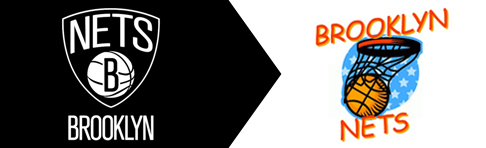
So everyone’s knows that the Nets, owned by Jay-Z, are no longer the New Jersey, or even New York Nets. Soon they’ll become the Brooklyn Nets. Of course Jay-Z, Marcy’s Finest, would bring the team to his home borough in order to leave a true mark on the City. He is a mogul! But the mark he designed and chose for the Nets logo is neither exciting nor designed well. It’s clear he wanted to go with a classic look and Jay himself is rarely seen in anything but black these days. But the lack of color in the design might have been too limiting. The whole logo lacks refinement and looks like the first or second pass at what should have been a long editing process.
I also find it ironic that Brooklyn, a borough undoubtedly filled with artistic types, will be represented by such a weak design. Any freelance designer in BK could have delivered on this challenge with a better logo. Oh well, the tees are printed.
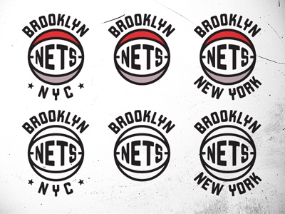
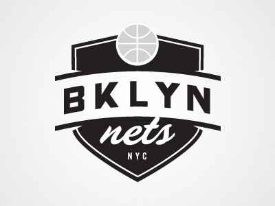
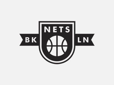
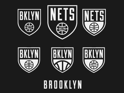
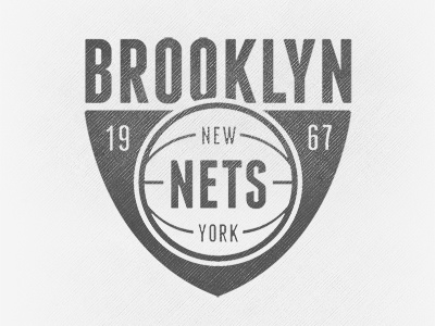
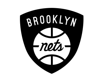
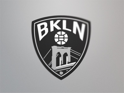
Here’s some Nets logo designs I found on Dribbble. Any of these would have better than the current symbol of Brooklyn basketball. Luckily, no one in Brooklyn cares about sports.